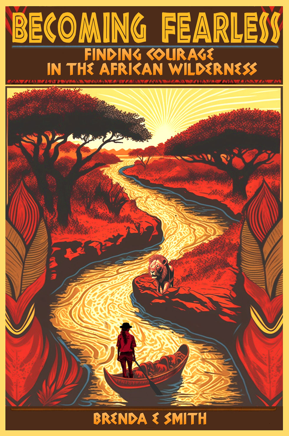
An Eye-Catching Book Cover
- EOP
- Jun 15, 2023
- 3 min read
Eye Opener Press: One of the most exciting aspects of publishing a book is choosing its cover design. For most readers, the initial impression given by a book’s cover will have the greatest impact on whether they pick the book up or click to open an E-book to find out more about it. The cover should not only be eye-catching, but it must convey a sense of what the book is about. Tell us about the process you used to pick a cover for Becoming Fearless: Finding Courage in the African Wilderness?
Brenda: Paper Raven Books served as a guide to help manage this process. They asked me to provide them with my ideas about what I thought the cover should look like. In the story, I purchased brightly colored Kanga cloths worn by the Tanzanian women, printed with geometric shapes in goldenrod, maroon and black. I’d also found an online image of a promotional poster encouraging travel to Africa with similar vibrant colors, featuring African icons inside the shape of the continent. I sent pictures of both to them, but emphasized I had a very open mind about the design.
Eye Opener Press: So, what did Paper Raven do with your ideas?
Brenda: They provided my images plus a chapter outline of the story to a company called 99 Designs that works with a network of thousands of independent graphic designers. Any designer who is interested in the project can submit a cover design as part of a five-day long competition. My design competition began on May 1st. As soon as the next day, we received several designs. The designers’ creative images amazed me.
Eye Opener Press: How many designs were submitted to Paper Raven, and how did you decide which one to pick?
Brenda: Initially, we received about 70 submissions. Paper Raven did the initial culling of the designs, and passed on to me about 12 designs they felt worthy of consideration. I noted what I liked and didn’t like about each. We encouraged the designers to tweak and resubmit their revised designs based on my comments. By May 5th I had to narrow my choices to just six designs to go to the second round of the competition.
Eye Opener Press: How hard was that process?
Brenda: Going from 12 to 6 was that difficult, but I only had one more week to ask for additional revision, then I had to pick a winner. There were two designs I like a lot. Paper Raven set up a poll I could send out to get other people’s opinions and comments on which design they liked best. I was delighted to see the two designs I liked best received the highest scores on the poll.
Eye Opener Press: So, the poll gave you some validation for the designs at the top of your list?
Brenda: Definitely! But for the decision between the top two designs, I had to follow my heart. I ended up going with the cover that came in a close second in the poll. The cover image is stunning and evokes the essence of the part of Africa I traveled through. I hope potential readers will be drawn to this cover.
Eye Opener Press: Are you ready to let us have a peek of the cover you chose?
Brenda: Absolutely! The front cover is a depiction of the river flowing through the jungle and shows what I had to face to find courage on this journey.

Eye Opener Press: If you’d like to be notified of promotions when you can pick up a free Ebook of Becoming Fearless: Finding Courage in the African Wilderness, click More Info below and we’ll add you to our E-mail list.


Comments